
PHASE TWO
The concept of change, a leap onto the next stage, the uncertainty of what things might phase to. 18-year-old Jacky Chao created this album during his final year in high school.
The album is released under Kitelines Music, LLC and Arcadia Media Collective on February 22nd, 2018.

THE PROCESS
I had the idea in my junior year that I wanted to create an album before finishing high school. I wanted the album to express my fear and excitement for college.
I related the fear of college to a spaceship headed forward in space, not knowing what's ahead and decided to incorporate space music techniques.
NAMING THE ALBUM
I needed something that accompanied the space aesthetic and carried the notion of change.

I had many ideas that symbolize
"change." But the concept of "2"
really stuck. To me, 2 is the bravest
number; 2 is the first iteration of change
(1 plus 1) among the number line. 2 didn't know what was ahead and yet was brave enough to change. And that's what I needed: courage. 2 is also closely related to me because I am a second child, I grew up being the second. 2 also has similar pronunciation with "To" which communicates forwardness, and travel.
(Album title ideation on the back of my health class worksheet)
Some possible titles I fiddled with:
-Second Life (reference to the work of one of my favorite artists: Vitalic)
-Chapter Two (the next chapter of life: College)
-The Second Sun (a play on being the second child, also signaling a brave new world)
-T.W.O (bold and straightforward)
-Phase Two (cold and modulated)
-The Next Stage (the next stage of life, College)
-2 (mysterious and straightforward)
I eventually decided to use Phase Two, reasons being:
-the text is visually pleasing
-simple and short
-the modulated sensation relates to the space theme
-unlike Second Life, The Next Stage, The Second Sun, it is solely focusing on 2, without implying 1.
COMPOSING THE STORY
The original idea was to have 10 songs and 1 bonus track, but the bonus track was eventually cut because the singer, Marcela Torres (who lives in Florida), was unable to deliver the vocals due to scheduling difficulties.
The concept of the story was to start off with the birth of the main character (the listener), who sets on a voyage through space to meet a variety of characters that are going through different types of change and eventually ends with the main character gathering up the courage to travel to a higher level of dimension, which the spaceship refers to as "Phase Two."
DESIGNING ALBUM ART
The main thesis of the album was to highlight the uneasy sentiment towards the unknown future: going to college. I knew that the cover art must present this ominous feeling.
I instantly knew that I wanted the composition to be geometric because, to me, nothing provokes mystery more than a couple simple shapes that represents something deeper.


(More cover art sketches on the back of my health class worksheet with what I believe is pizza grease.)

(Cover art ideation sketches on the back of my health class worksheet)
I decided to capture the critical moment of the main character traveling in space, approaching the unknown while being accompanied by the characters he met throughout the album.
The main character is represented as the red line traveling across the page while the blue and yellow lines represent the rest of the characters. I've experimented with different orientation of the lines, but I eventually settled on a diagonal, bottom-right towards top-left line because it is the longest path a line can travel on a square while also traveling in the most uncertain direction (the line fully disobeys the way humans read, leading the eyes in an uncomfortable direction).
After ideation, the cover art is made in Adobe Illustrator with the help of my brother, Bruce, who has been incredibly supportive throughout this project. Multiple iterations of the cover art was made, each slightly difference in style. The topographic spacey background was made by piling on numerous filters to a space image found on the internet. The album title was put in the center of the composition signaling the moments before the main character crosses over to the higher dimension. The typeface used is Fivo Sans Modern.


JEWEL-CASE CD ART DESIGN
After designing the album cover art, the Jewel Case CD art design remains.
The tri-fold
The purpose of the trifold is to hold extra information about the album. I began by gathering the names of everyone that participated in the production of this album to see how much space I needed. And designed the rest of the space as "Special Thanks To" and extra arts to fill up the space.


(Album CD art ideation sketches in notebook)
(Tiny tri-fold prototype made using part of a printer paper)
(Names of everyone that should be included in the credits)
(Final tri-fold layout front and back, constructed in Adobe Illustrator.)


(Final officially printed tri-fold front and back. Printing by Disc Makers)
The back of the Jewel Case and CD
The designs on the back of the Jewel Case and the CD are kept minimal. The same topographic space background is used for both compositions.


(Final official design for the back of the Jewel Case, made in Adobe Illustrator.)
(Final official CD design, made in Adobe Illustrator.)
(Officially printed CD in a CD player. Printing by Disc Makers.)
PROMOTIONAL MATERIALS
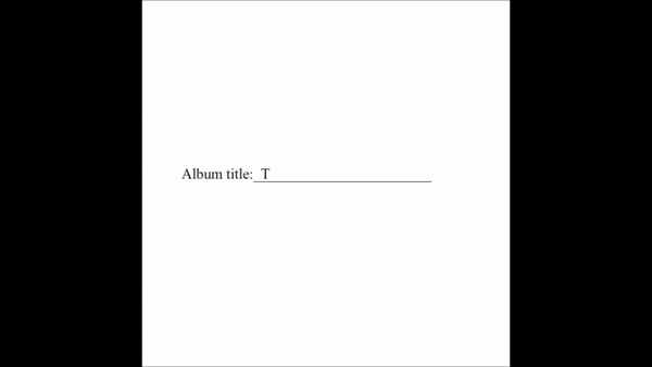
(Animation of me naming the album)
(Quote from the album)
(Six days count-down to the release of the album)
(The red line in the album cover in motion)


(Typographic design of 2, Fivo Sans Modern)
(Bulk of CDs finally arrived!)
(Close-up of the tip of the red line)
(Close-up of the tip of the yellow line)
(Close-up of the tip of the blue line)
(2 seconds left on a cross-walk light.)
(Level 2 elevator sign in the garage at the Galleria)
(Variety of 2 in different typefaces found in San Antonio)
(2 sign outside of a barber shop)
(Custom made Phase Two fabric speaker shield)